“A picture is worth a thousand words”
Download data set from kaggle
https://www.kaggle.com/datasets/spscientist/students-performance-in-exams
import pandas as pd
df = pd.read_csv(r’C:\Users\laxmi\Documents\StudentsPerformance.csv’)
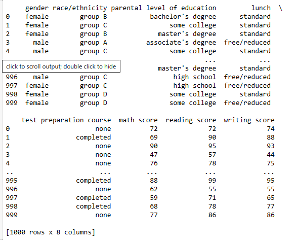
print(df)
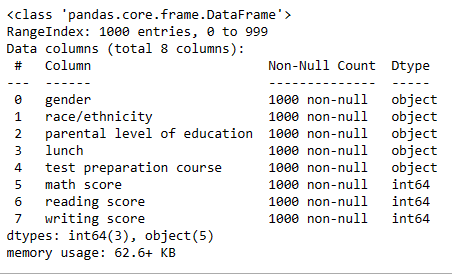
df.info()
import numpy as np
from sklearn.pipeline import make_pipeline
import matplotlib.pyplot as plt
import seaborn as sns
from scipy.stats import norm
from sklearn.metrics import mean_absolute_error
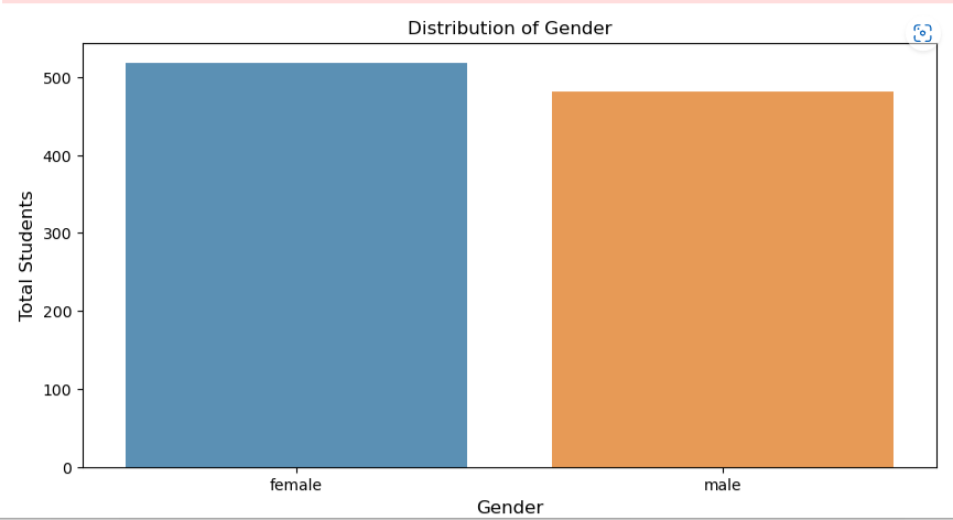
gender_count = df[‘gender’].value_counts()
gender_count = gender_count[:10,]
plt.figure(figsize=(10,5))
sns.barplot(gender_count.index, gender_count.values, alpha=0.8)
plt.title(‘Distribution of Gender’)
plt.ylabel(‘Total Students’, fontsize=12)
plt.xlabel(‘Gender’, fontsize=12)
plt.show()
df = pd.read_csv(r’C:\Users\laxmi\Documents\StudentsPerformance.csv’)
sns.barplot(data=df, x=”Gender”, y=”Total Students”)
import pandas as pd
import seaborn as sns
import matplotlib.pyplot as plt
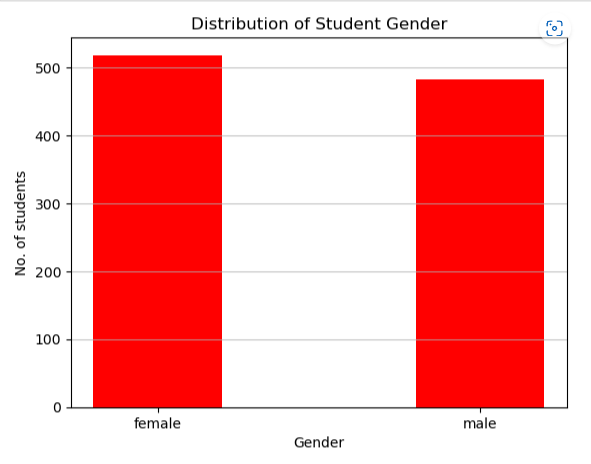
df_gender = df[‘gender’].value_counts()
plt.bar(df_gender.index, df_gender, color =’red’,
width = 0.4)
plt.xlabel(“Gender”)
plt.ylabel(“No. of students”)
plt.title(“Distribution of Student Gender”)
plt.grid(axis=”y”, alpha=0.75)
plt.show()
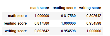
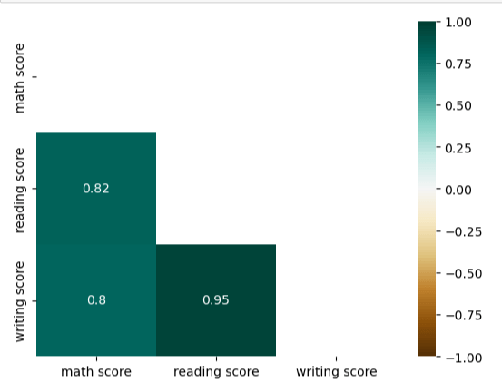
df.corr()
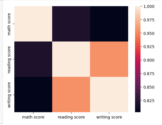
import seaborn as sns
sns.heatmap(df.corr());
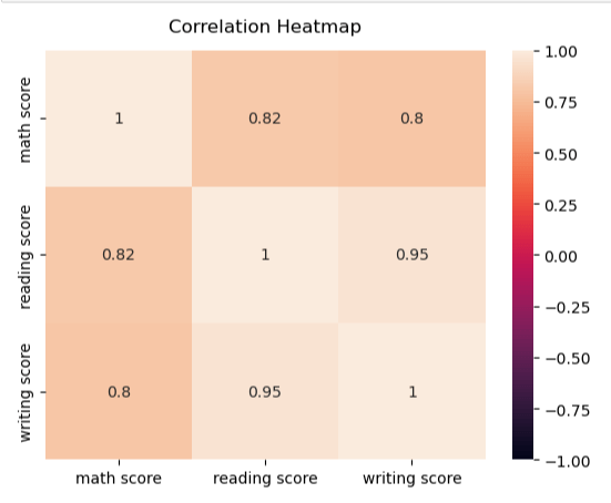
heatmap = sns.heatmap(df.corr(), vmin=-1, vmax=1, annot=True)
#Give a title to the heatmap. Pade defines the distance of the title from the top of the heatmap
heatmap.set_title(‘Correlation Heatmap’, fontdict={‘fontsize’:12}, pad=12);
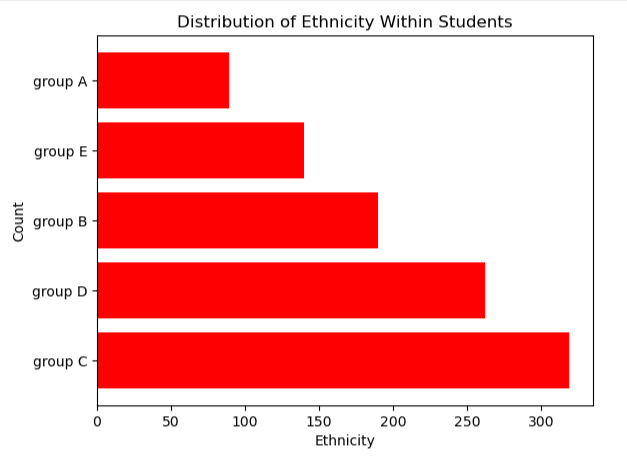
import numpy as np
df_race = df[‘race/ethnicity’].value_counts()
plt.barh(df_race.index,df_race.values, color=’r’)
#Axis Label
plt.xlabel(‘Ethnicity’)
plt.ylabel(‘Count’)
#Title
plt.title(“Distribution of Ethnicity Within Students”)
plt.show()
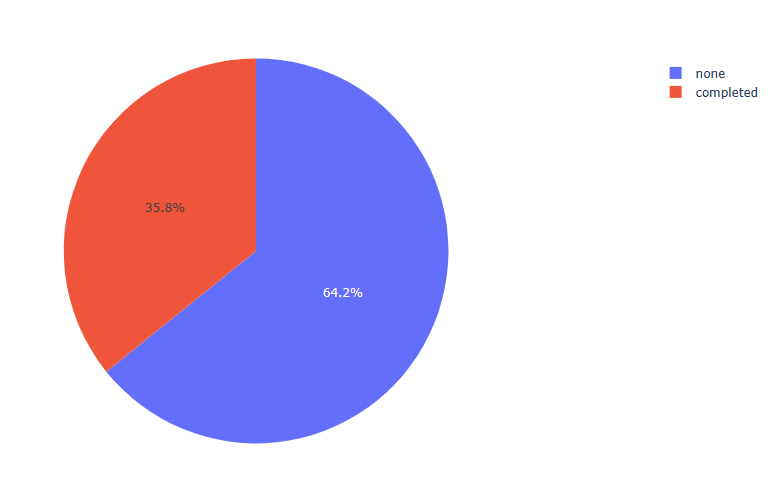
import plotly.express as px
fig2 = px.pie(df, values = df[‘parental level of education’].value_counts().values,
names = df[‘parental level of education’].value_counts()
fig3 = px.pie(df, values = df[‘race/ethnicity’].value_counts().values, names = df[‘race/ethnicity’].value_counts().index)
fig3.show()
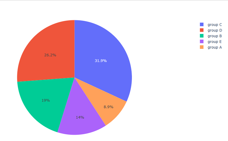
fig4 = px.pie(df, values = df[‘lunch’].value_counts().values, names = df[‘lunch’].value_counts().index)
fig4.show()
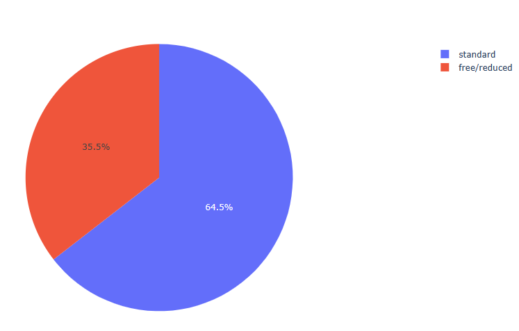
fig5 = px.pie(df, values = df[‘test preparation course’].value_counts().values, names = df[‘test preparation course’].value_counts().index)
fig5.show()
df[‘math score’].describe()
count    1000.00000
mean       66.08900
std        15.16308
min         0.00000
25%        57.00000
50%        66.00000
75%        77.00000
max       100.00000
Name: math score, dtype: float64


mask = np.triu(np.ones_like(df.corr(), dtype=bool))
heatmap = sns.heatmap(df.corr(), mask=mask, vmin=-1, vmax=1, annot=True, cmap='BrBG')
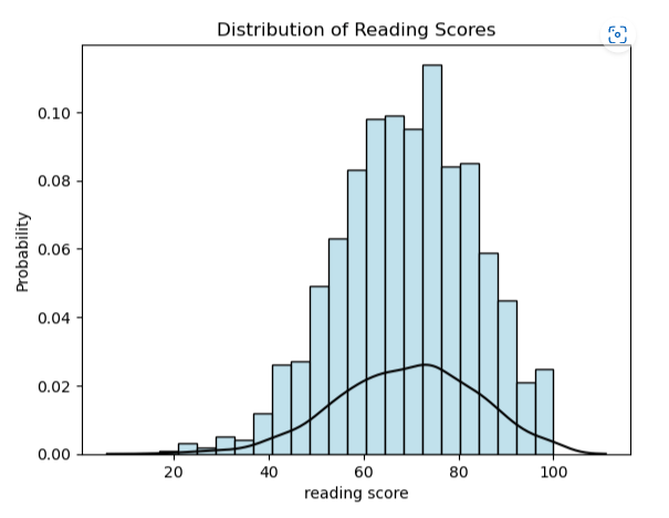
sns.histplot(df[‘reading score’], stat=”probability”, fill=True, color =’lightblue’).set(title=’Distribution of Reading Scores’)
Distribution Line
sns.kdeplot(df[‘reading score’], color=”black”)
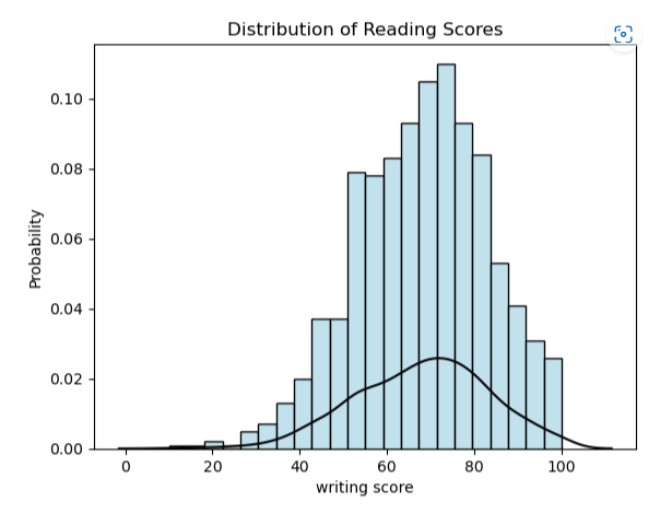
import seaborn as sns
sns.histplot(df[‘writing score’], stat=”probability”, fill=True, color =’lightblue’).set(title=’Distribution of Reading Scores’)
Distribution Line
sns.kdeplot(df[‘writing score’], color=”black”)
nRowsRead = 1000 # specify ‘None’ if want to read whole file
df1 = pd.read_csv((r’C:\Users\laxmi\Documents\StudentsPerformance.csv’), delimiter=’,’, nrows = nRowsRead)
df1.dataframeName = ‘StudentsPerformance.csv’
nRow, nCol = df1.shape
print(f’There are {nRow} rows and {nCol} columns’)
There are 1000 rows and 8 columns

import plotly.express as px

fig10 = px.histogram(df, x="math score", marginal = 'box')
fig10.show()
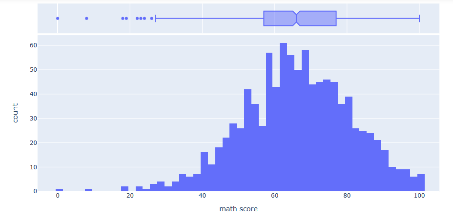
fig11 = px.histogram(df, x=”writing score”, marginal = ‘box’)
fig11.show()
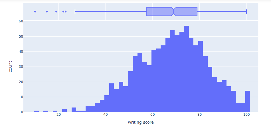
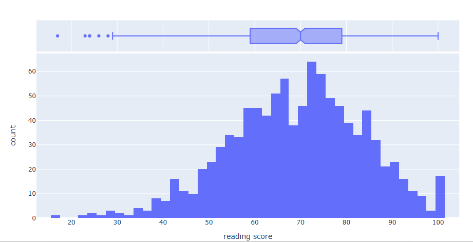
fig13 = px.histogram(df, x=”reading score”, marginal = ‘box’)
fig13.show()
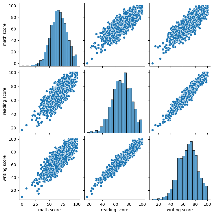
import matplotlib.pyplot as plt
sns.pairplot(df)
plt.show()
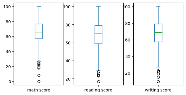
df.plot(kind=’box’, subplots=True, layout=(2,4), sharex=False, sharey=False, figsize=(10,8))
plt.show()
print(df.mean(numeric_only=True))
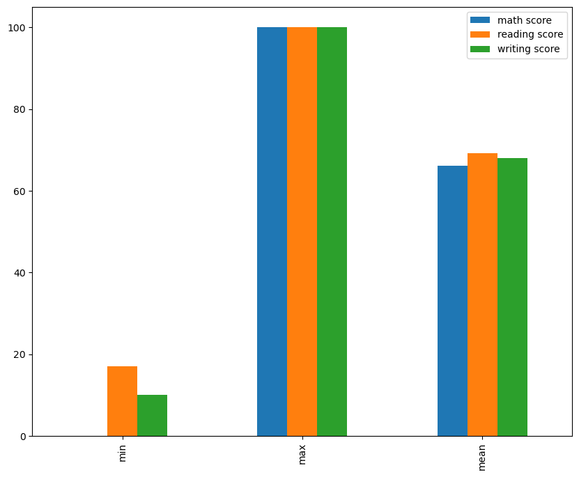
math score       66.089
reading score    69.169
writing score    68.054
dtype: float64


df.describe().loc[['min','max','mean']].plot(kind='bar', figsize=(10,8))
plt.show()
My git hub link for another project not this
Laxmihe/Pandas-Tricks: Pictorial display of plots (github.com)

One thought on “My python codes”