I cannot draw.
Like, really cannot draw. Stick figures are a genuine challenge. My hands produce shaky lines, uneven circles, and whatever the opposite of “artistic vision” is.
So when I decided to make a YouTube video about inflation and savings accounts, I had a problem.
Every finance channel uses charts, graphs, and talking heads. I didn’t want to be another face on camera. I wanted something different. Something that felt human, not corporate. Something my non-finance friends would actually watch.
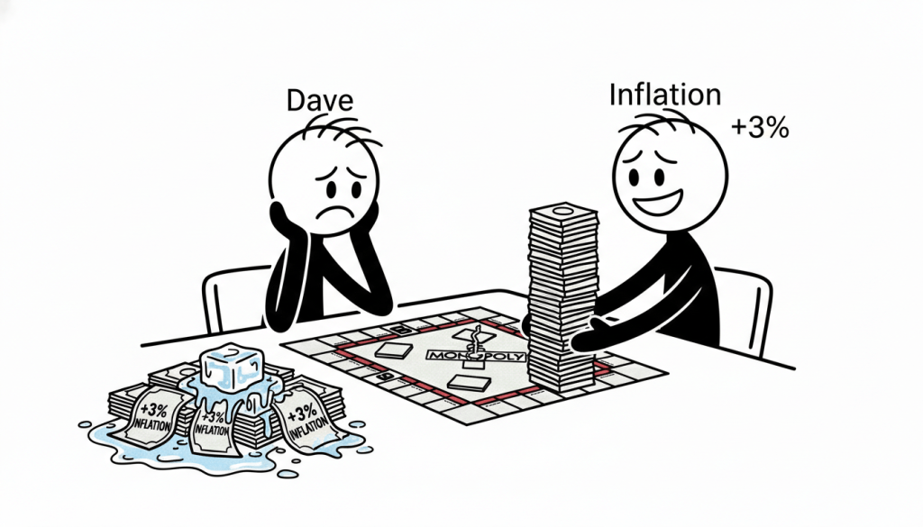
Somehow, I ended up here:
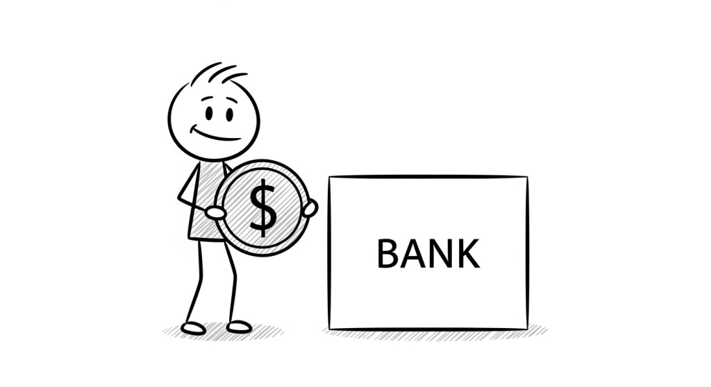
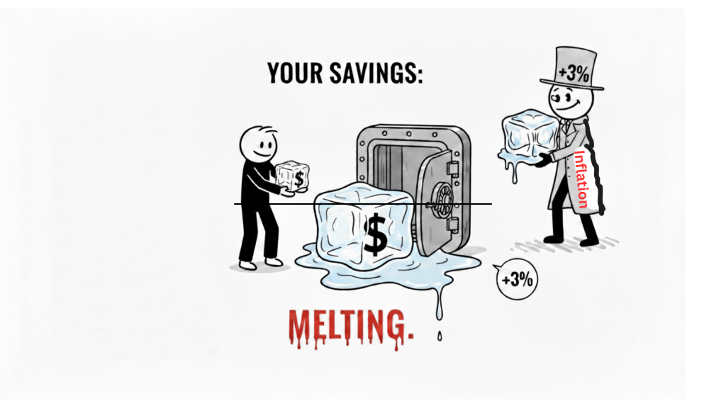
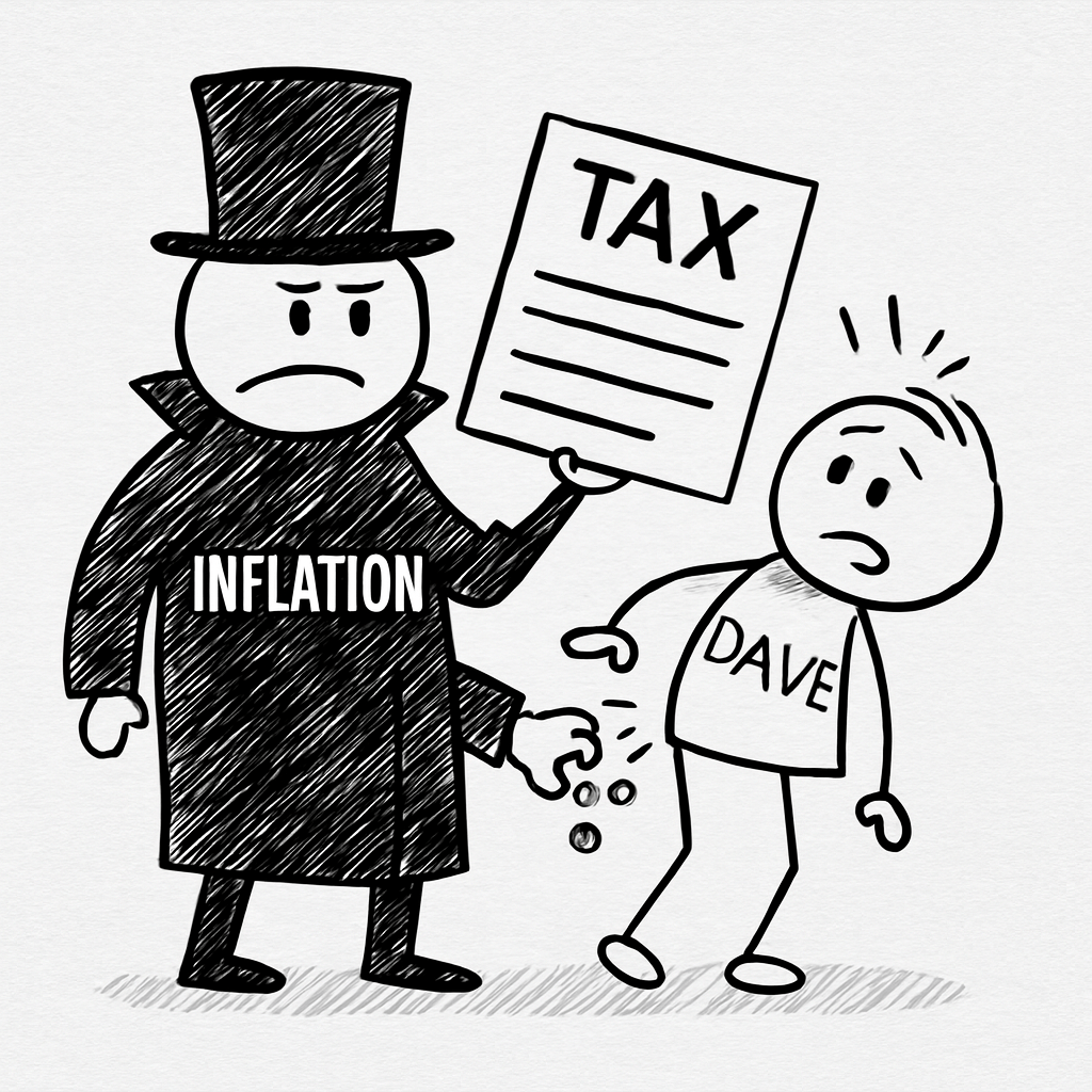
A stick figure named Dave. A villain in a top hat named Inflation. A melting ice cube labeled “YOUR SAVINGS.”
The video is live now. People are watching it. And I never picked up a pen.
Here is exactly how I did it—and why I think this approach might work for you too.
The Problem With Most Finance Videos
Before I started, I spent a week watching YouTube finance content.
The pattern was everywhere:
- A man in a blazer standing in front of a bookshelf
- A whiteboard with messy handwriting
- Stock footage of graphs going up and down
- The same “passive income” thumbnail with red arrows
I wasn’t learning. I was scrolling past.
The numbers are there. The trust isn’t.
I kept thinking: Why does money education have to look like a corporate training video?
Then I saw a Kurzgesagt video about black holes. Then I saw a Ghibli film. Then I saw someone on Twitter making stick figure comics about burnout.
And I thought: What if finance looked like this?
Not authoritative. Not intimidating. Just… friendly.
We do not endorse or promote any specific finance. Information is based on publicly available data as of 2026 and may change without notice.
The Tools I Actually Used
Here is the part I was embarrassed about at first.
I did not animate anything.
I did not draw frame-by-frame. I did not rig characters in After Effects. I did not spend 80 hours on a 4-minute video.
I typed words into boxes.
- Whisk for images. I described Dave. I described Inflation. I described a melting ice cube with a dollar sign inside. The AI drew them.
- FlexClip for motion. I uploaded Dave standing still. I typed “walks slowly, looks worried.” The AI moved him.
- CapCut for voice. I wrote a script. I pasted it into text-to-speech. I adjusted the pitch down slightly so it didn’t sound like a robot reading terms and conditions.
Total time for the first video: About 6 hours spread across a weekend.
Total drawing ability required: Zero.
The Part I Almost Got Wrong
My first attempt was ugly.
Not stylized ugly. Not “handmade aesthetic” ugly. Just genuinely difficult to look at.
Dave had three different hairstyles across three scenes. Inflation changed height between shots. The ice cube looked like a generic rectangle with water on it.
I didn’t realize consistency was a skill.
Then Whisk generated one image that changed everything.
Dave, five strands of hair. Dot eyes. Neutral expression. Inflation, top hat, trench coat, no face. Pure white background. Simple black lines. Light cross-hatching for texture.
I saved that image. I named it “STYLE REFERENCE.”
Every prompt after that began with the same description. Copy, paste, adjust the action. Dave always had five hairs. Inflation never got a face. The background never changed.
This single habit saved me hours of editing and gave the video an actual visual identity.
The Metaphor That Almost Didn’t Happen
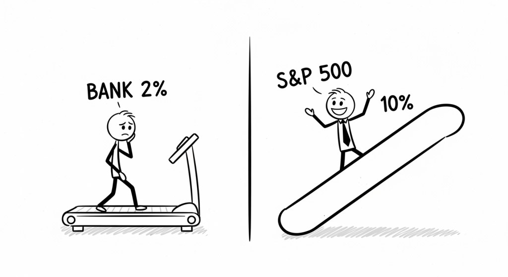
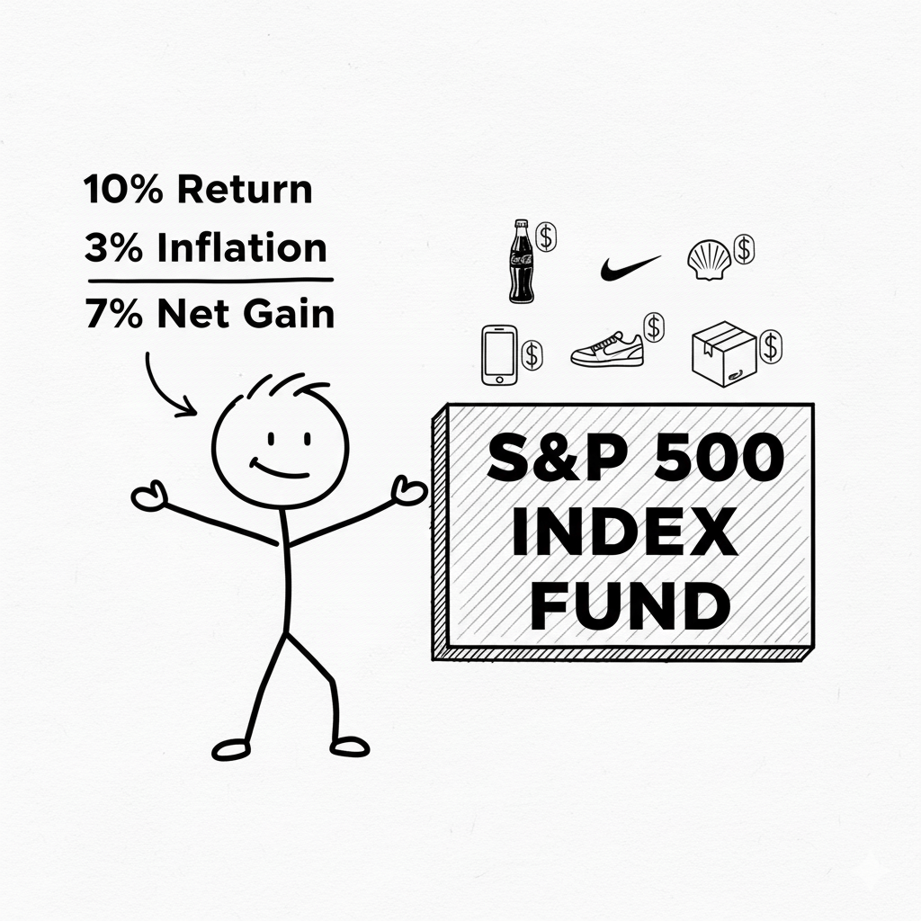
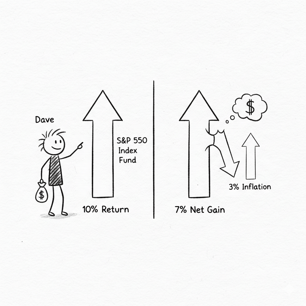
The script was fine. Numbers, explanations, S&P 500, disclaimer.
But it was boring.
Then I changed one line.
“This isn’t a bank. It’s a slowly melting ice cube.”
I almost deleted it. Too simple. Not professional enough. A finance video shouldn’t compare compound interest to kitchen appliances.
I kept it anyway.
That line is now the thumbnail. Dave, worried, holding a dripping cube labeled with a dollar sign. Viewers click because they need to know what the ice cube means.
The metaphor did what charts could not. It made people feel something.
What I Learned About Viewers
I expected people to comment on the math. “Actually, 4% HYSA minus 3% inflation is 1% net gain, not negative—”
Instead, they commented on Dave.
“Poor Dave.”
“I am Dave.”
“Dave needs a better bank.”
They weren’t calculating. They were projecting.
They saw a tiny stick figure getting rained on by a dark cloud labeled “INFLATION 3%” and thought: That’s me.
The numbers were secondary. The story was primary.
What I’d Do Differently Next Time
1. I’d make the subscribe link one-click from day one.
I spent two weeks sending people to my channel page like a tourist. The one-click link is in the description now. It should have been there at publish.
2. I’d lock the character design before writing the script.
I wrote scenes before I knew what Dave looked like. This caused unnecessary re-prompts. Next time, I generate the hero image first and write around it.
3. I’d publish 48 hours sooner.
The last 10% of polish took 40% of the time. The thumbnail was “almost ready” for three days. The audio was “almost perfect” for two more.
Viewers do not notice the difference between 95% perfect and 98% perfect.
They notice that the video exists.
Why I’m Sharing This
I am not a successful creator. I have one video and 14 subscribers. (Update: 22 now. Someone watched twice.)
But I spent years waiting for permission. Waiting for drawing skills. Waiting for the perfect microphone. Waiting for the moment I’d feel “ready.”
This video proved that readiness is fake.
I used AI tools that felt like cheating. I wrote a script in 45 minutes. I generated images while eating lunch. I published with a thumbnail I made in a browser tab.
And it worked. Not viral. Not life-changing. But it worked.
What’s Next
Video 2 is about compound interest.
Dave plants a seed. It grows into a tree. The tree has tiny iPhones and Nike shoes growing on it.
I already have the prompt written.
If you’re sitting on an idea because you can’t draw, can’t animate, or don’t “look like a YouTuber”—this is your sign to use the tools anyway.
Dave didn’t wait until he could draw himself. He just showed up.
You can too.
The One-Click Subscribe Trick That Grew My Channel Faster (And Why Most Creators Miss It)
I spent weeks obsessing over thumbnails, scripts, and retention curves.
Then I realized I was losing subscribers on the finish line.
Someone watches your 4-minute explainer. They liked it. They want to subscribe. But they have to:
- Click your channel name
- Wait for the page to load
- Visually scan for the red button
- Click again
That’s four steps. Four opportunities for them to get distracted by a cat video and never come back.
There’s a faster way. YouTube built it years ago. Almost no one uses it.
The Link That Subscribes in One Click
It looks like this:
That’s it. Someone clicks it, they subscribe instantly. No confirmation screen. No second thought. Just a +1 in your subscriber count and a “Thanks for subscribing” message.
I felt stupid when I learned this. I’d been sending people to my channel page like it was 2015.
Why This Actually Matters for Growth
YouTube is a suggestion engine.
When someone subscribes, YouTube thinks: “This person liked this channel enough to hit the button. Show them more.”
Your video gets pushed. Your next upload appears in their feed automatically. The algorithm stops treating you like a stranger and starts treating you like family.
But none of that happens if they bounce during the two extra clicks.
Friction is the enemy of growth. This link removes friction.
Where I Put Mine Now
Top of the description. First three lines. No exceptions.
Not buried after timestamps, resource links, and my life story. Right there, visible without clicking “more.”
🔔 Subscribe in one click (seriously, one click):
[Your channel link with ?sub_confirmation=1]
I also pin it in the comments within 60 seconds of publishing.
Why the comments? Because YouTube ranks comments by engagement. A pinned subscribe link stays at the top forever. Every new viewer scrolls down, sees it immediately, and one-click subscribes while reading what other people thought of the video.
It’s like having a billboard inside your own theater.
The Psychological Trick Nobody Talks About
When you send someone to your channel page, you’re asking them to decide whether to subscribe.
When you use the one-click link, you’re assuming they already have.
It’s a small shift. But it changes everything.
“I like this. I want more. Click.”
vs
“I like this. Should I subscribe? Let me check out their other videos first. Wait, what was I doing?”
The first path takes one second. The second path takes ten seconds and a mental debate.
Never let your viewer talk themselves out of subscribing.
What This Looks Like in Practice
Here’s my exact description template now:
You just watched a 4-minute explainer on why your savings account is melting. No jargon. No get-rich-quick. Just visual finance.
🔔 Subscribe in one click for more stick figure finance lessons:
[Your one-click link]
⏱️ TIMESTAMPS:
0:00 – Meet Dave
0:20 – The Trap
… etc.
📚 RESOURCES:
…
Clean. Direct. Zero friction.
The Part That Made Me Nervous
I worried it felt pushy.
“One-click subscribe link? Isn’t that a little aggressive?”
Then I checked my analytics. The videos with the one-click link in the top three lines gained subscribers three times faster than the ones where I buried it politely at the bottom.
Viewers aren’t offended by a clear call to action. They’re grateful for it.
They just spent four minutes with you. They liked what they saw. They want to know what’s next.
Give them the shortest possible path to “what’s next.”
Your Turn
Copy your channel ID from YouTube Studio. It looks like UCKgkvw-W0exhS7x8PYZxWHg or similar.
Paste it into this:
Put that link in your next video description. First three lines. No excuses.
Then watch what happens when you stop asking people to subscribe and start letting them.
Have you tried this yet? Or are you still sending people to your channel page like I was for two years? Drop a comment below—I read every single one.
Disclaimer: This article is for informational purposes only and does not constitute financial advice. Loan rates, terms, and funding speed may vary by lender, credit profile, and state regulations. Always review official lender disclosures and consult a qualified financial professional before making borrowing decisions.
